The credit card application in the Synchrony Plug-In was the first feature that was reviewed for a redesign, before the rest of the experience was touched.
This was considered a critical feature to improve, as it would be the user's first glimpse into the Synchrony Plug-In (SyPI) and Synchrony as a credible financial services provider.
Along with the challenges in the broader experience, this specific project had us consider a few questions that we turned into goals.
How might we provide users with a satisfying application experience that attracts and retains their attention?
How might we provide a pleasant user experience that minimizes frustration and allows users to quickly and confidently completely their tasks?
... ultimately, how might we build trust in our user?
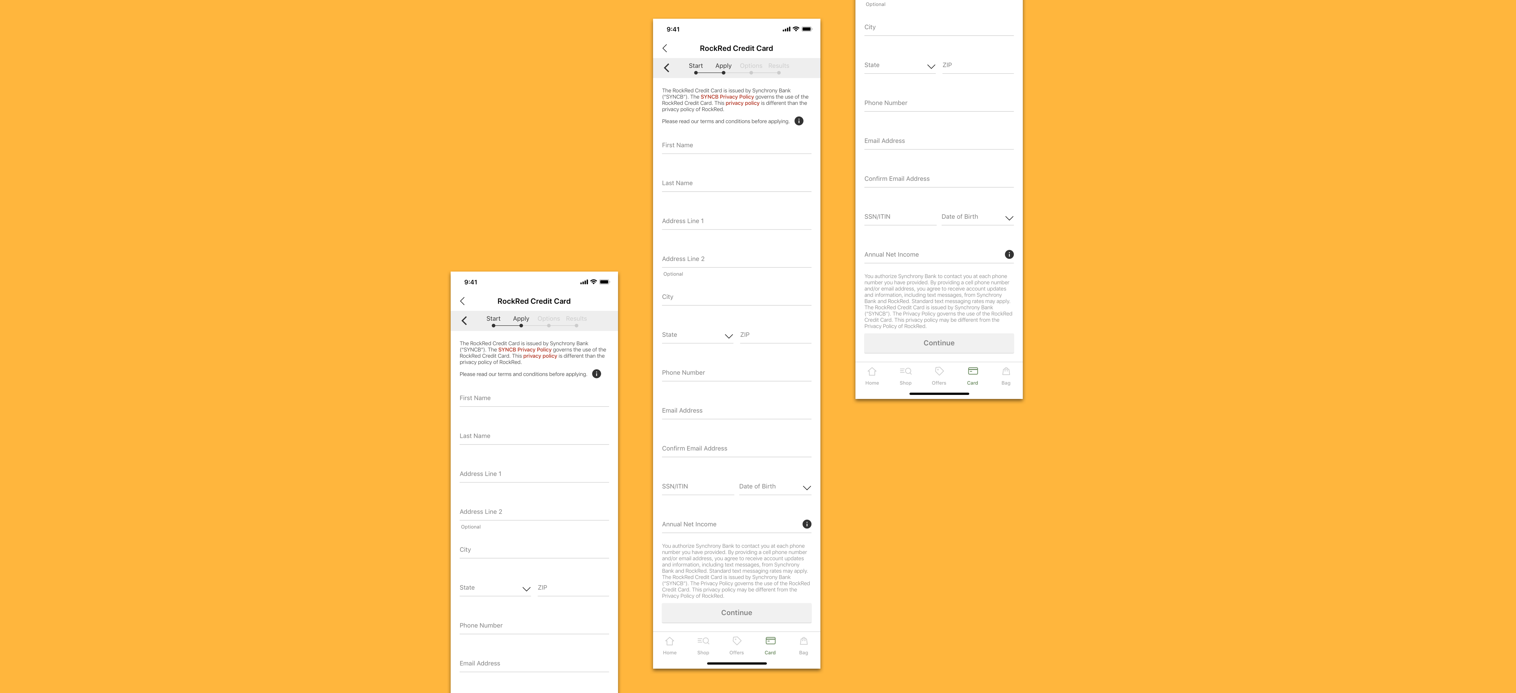
The original application experience
We started off by looking for patterns and inspiration from other apps in the marketplace.
In particular, we looked for -
1. How apps like Uber and Venmo handled their credit/debit card application experiences
2. How apps presented secondary experiences within their main environment
3. Patterns and elements that promoted a modern interface
What we found was that -
• The applications or sign-up experiences were often broken up into bite-sized pieces, screen by screen. Users had to tap through each screen, but the application was less daunting and more digestible.
• The application used conversational language to guide the user through the form.
• Full screen modals with a close button were a seamless way to transition to a new section and keep the user focused on the task at hand.
• Native iOS modals were another effective way to redirect attention in a flow, and layer content.
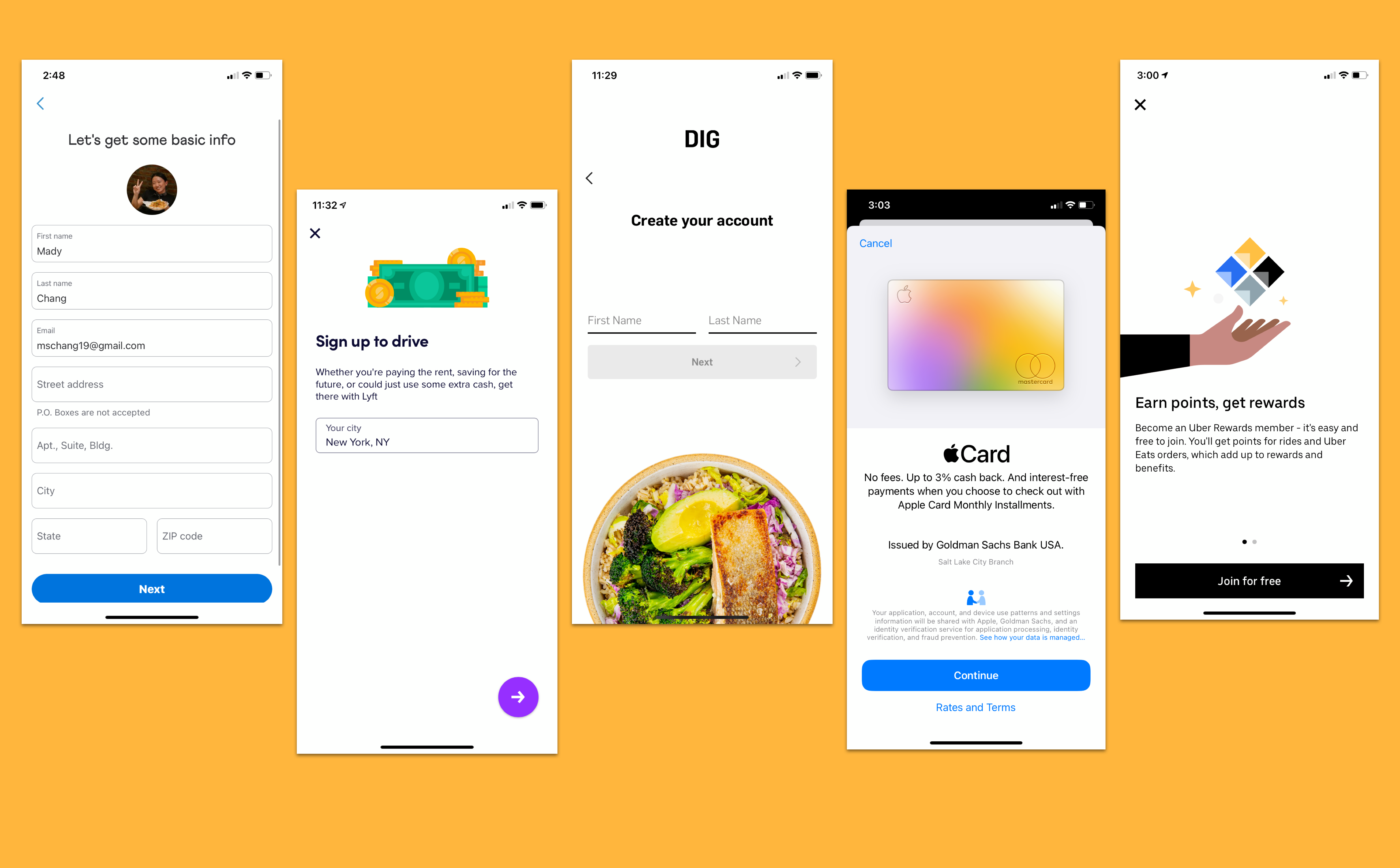
Some of the competitor apps we looked at
We then sketched as many ideas as we could on paper, until we found a few key concepts we would want to test.
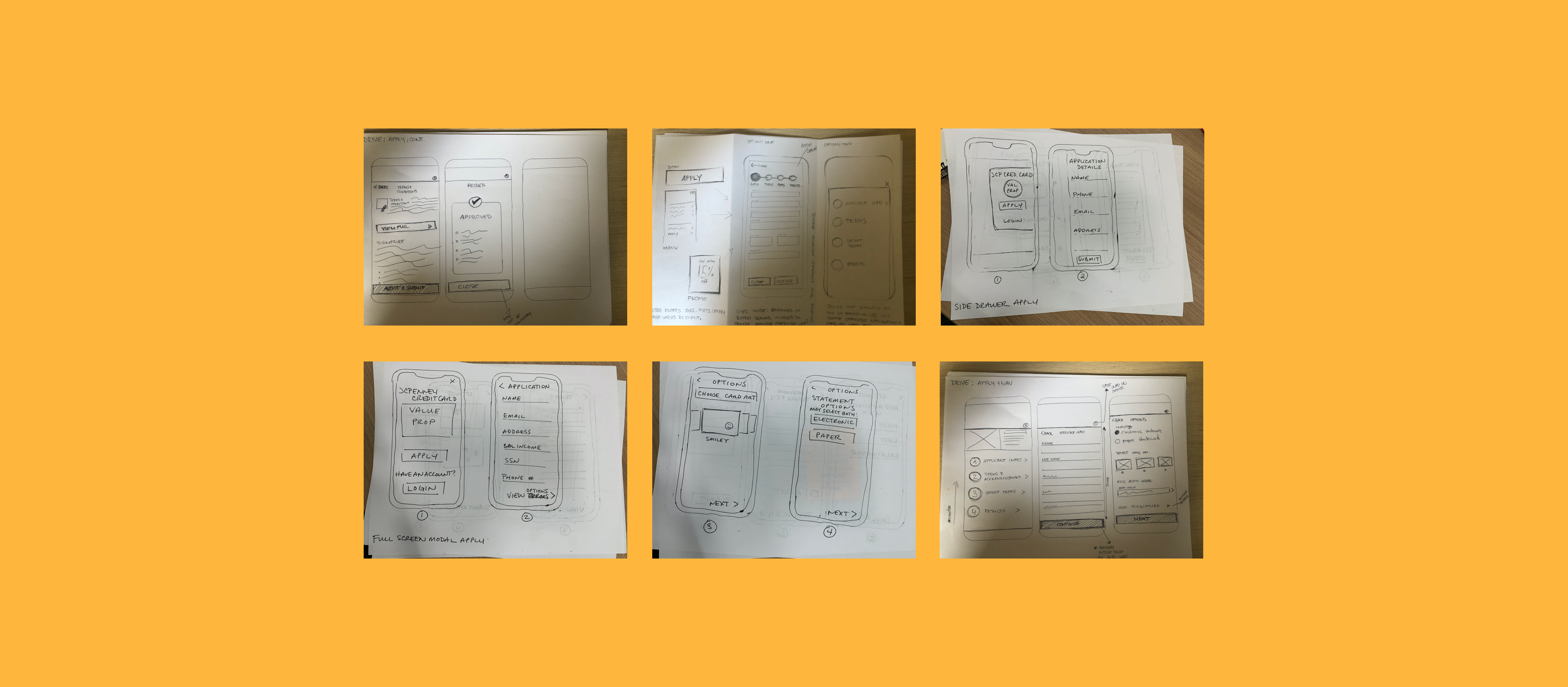
Early stage sketching
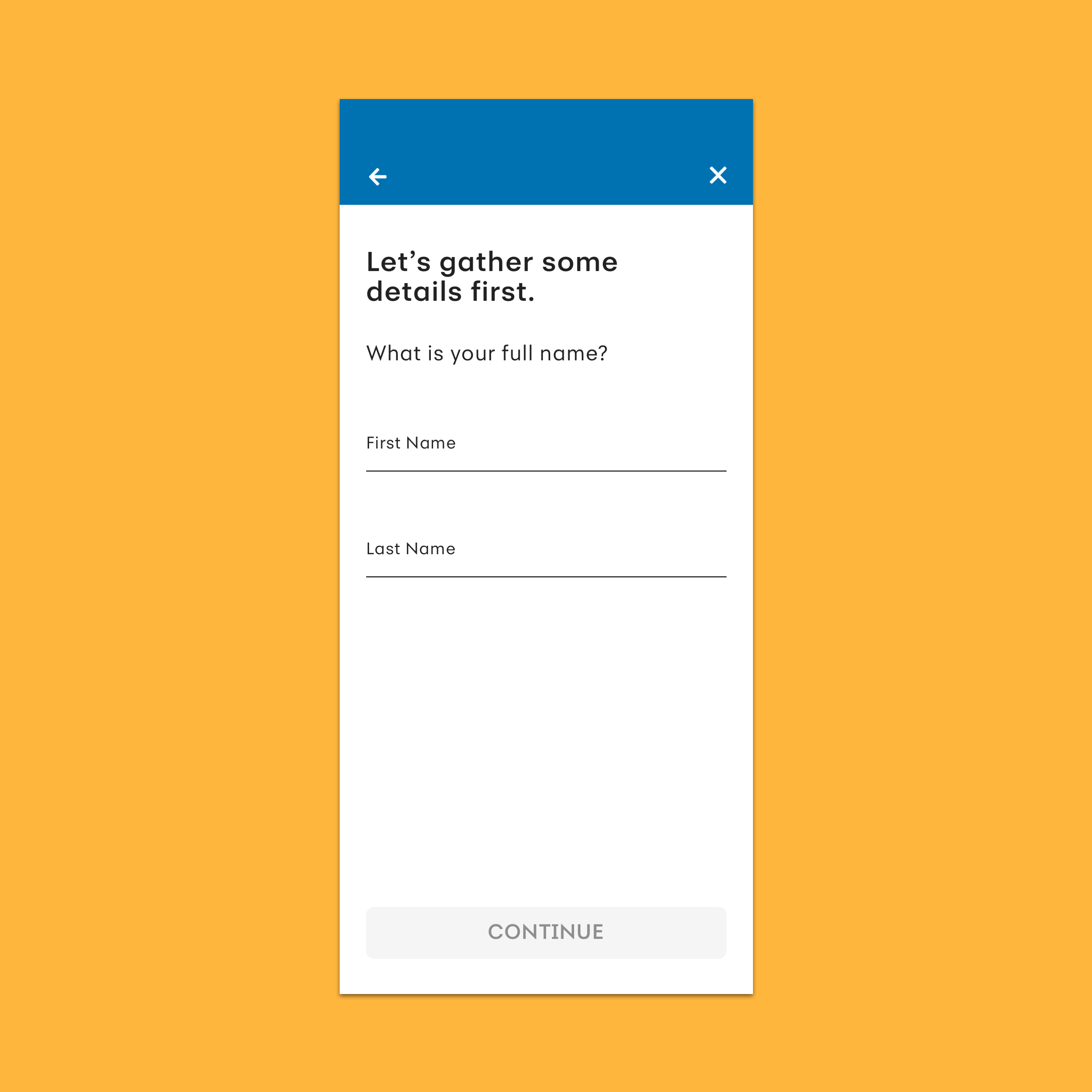
We made four separate prototypes to test, and added the original application design to test as well.
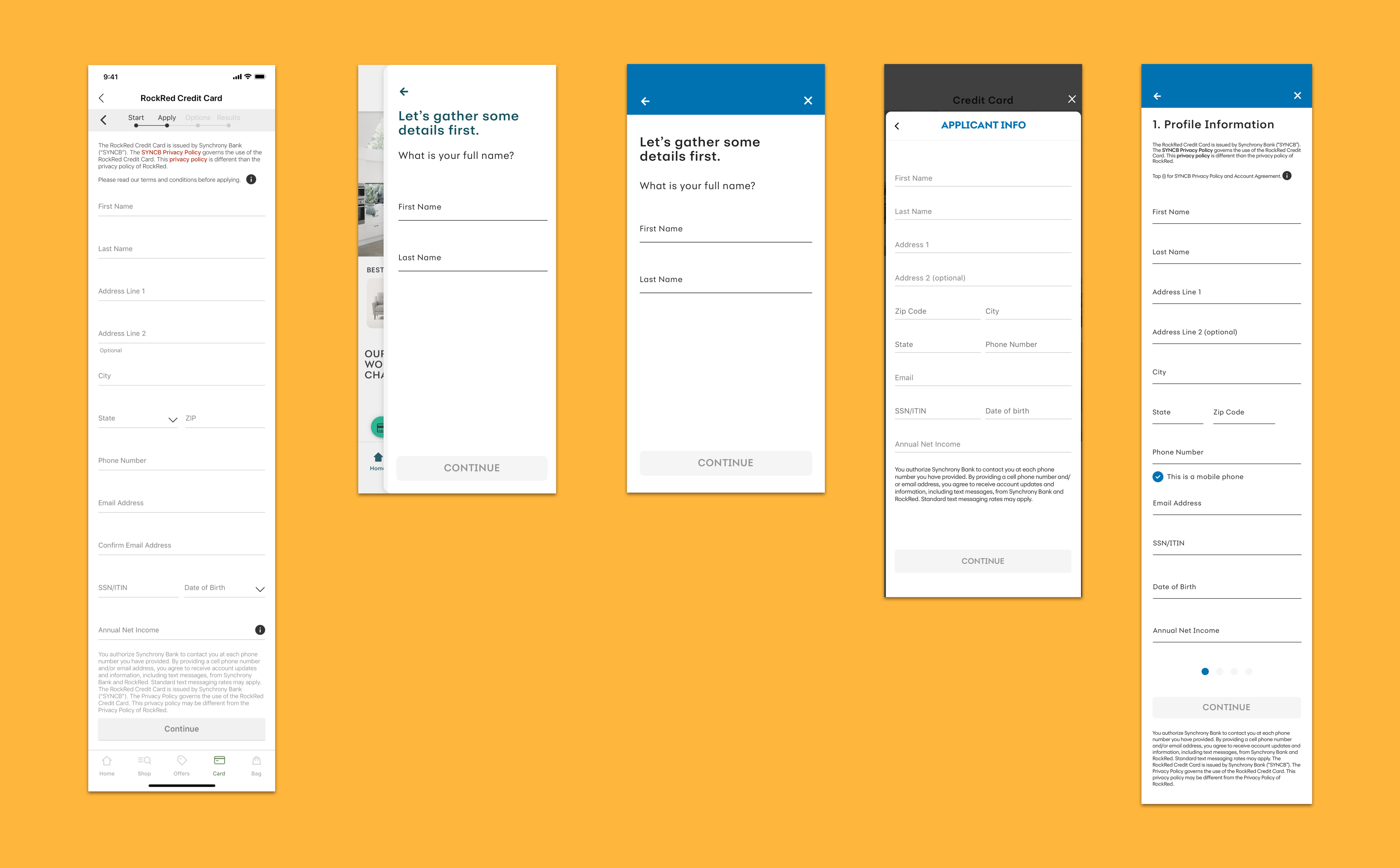
Concepts we tested along with the original design
We had 64 participants, and had 16 of those participants provide some qualitative video feedback on their experience.
We asked rating questions such as -
• It was easy to apply for a new credit card using this application tool
• I believe that the personal information used to apply for the new card application will be kept private and safe
• The language used in the application felt personable
• The application looked modern and up to date
We also asked some qualitative questions for users to talk-out-loud, such as -
• What are your overall impressions?
• How comfortable are you sharing your personal information in this app?
• What concerns, if any, would you have about your information?
There were the two concepts that stood out the most in the results.
These two concepts (Concepts A and B) were both rated highest across all five designs for ease of completion, clear instructions, and modern layout.
Concept B was rated highest in privacy and safety and personable language, but took the longest time to complete.
"Provided an easier start up process." - test user
"It felt friendlier from the wording and started simpler with less information to enter." - test user
Concept A overall performed best across all five concepts.
It was also preferred most often (59%), had the second fastest completion time, and the fewest mean clicks.
"For me, entering the information on a longer screen instead of going to multiple screens and hitting a button feels less clunky and less time consuming." - test user
"Concept A was easier to read and had a more modern look to it." - test user
We landed on some key takeaways from this test.
• Retain the application form on a single screen
• Break up the content
• Weave in conversational language
We were surprised that users preferred a long form application on a single screen as opposed to bite-sized pieces, but we understood that the visual design of the long form was important. The content should be digestible and scannable with enough breathing room between the lines.
We also found it incredibly interesting that designs with conversational language rated 5% higher in privacy and safety, and would make sure to move that needle in building trust as much as we could.
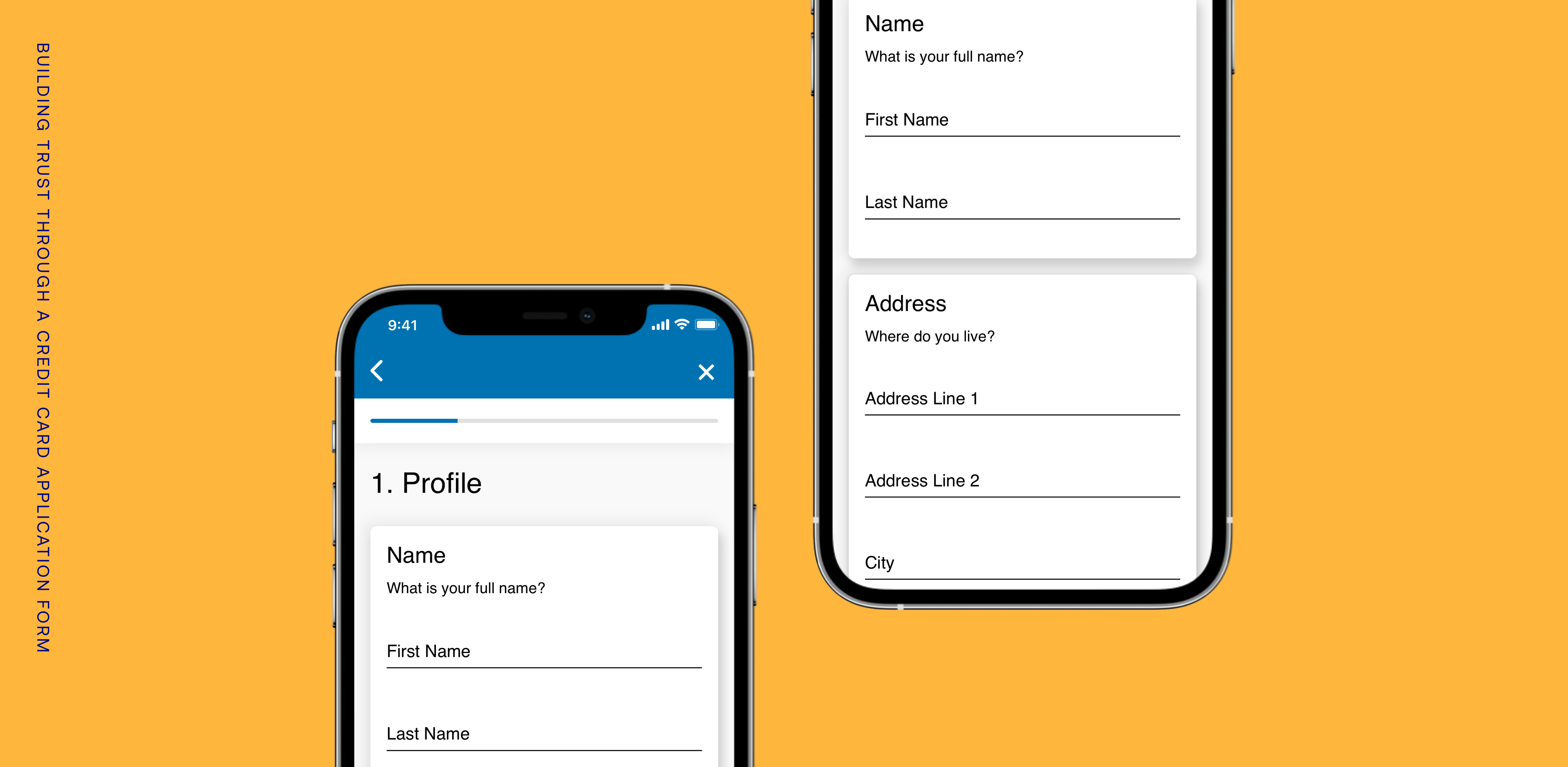
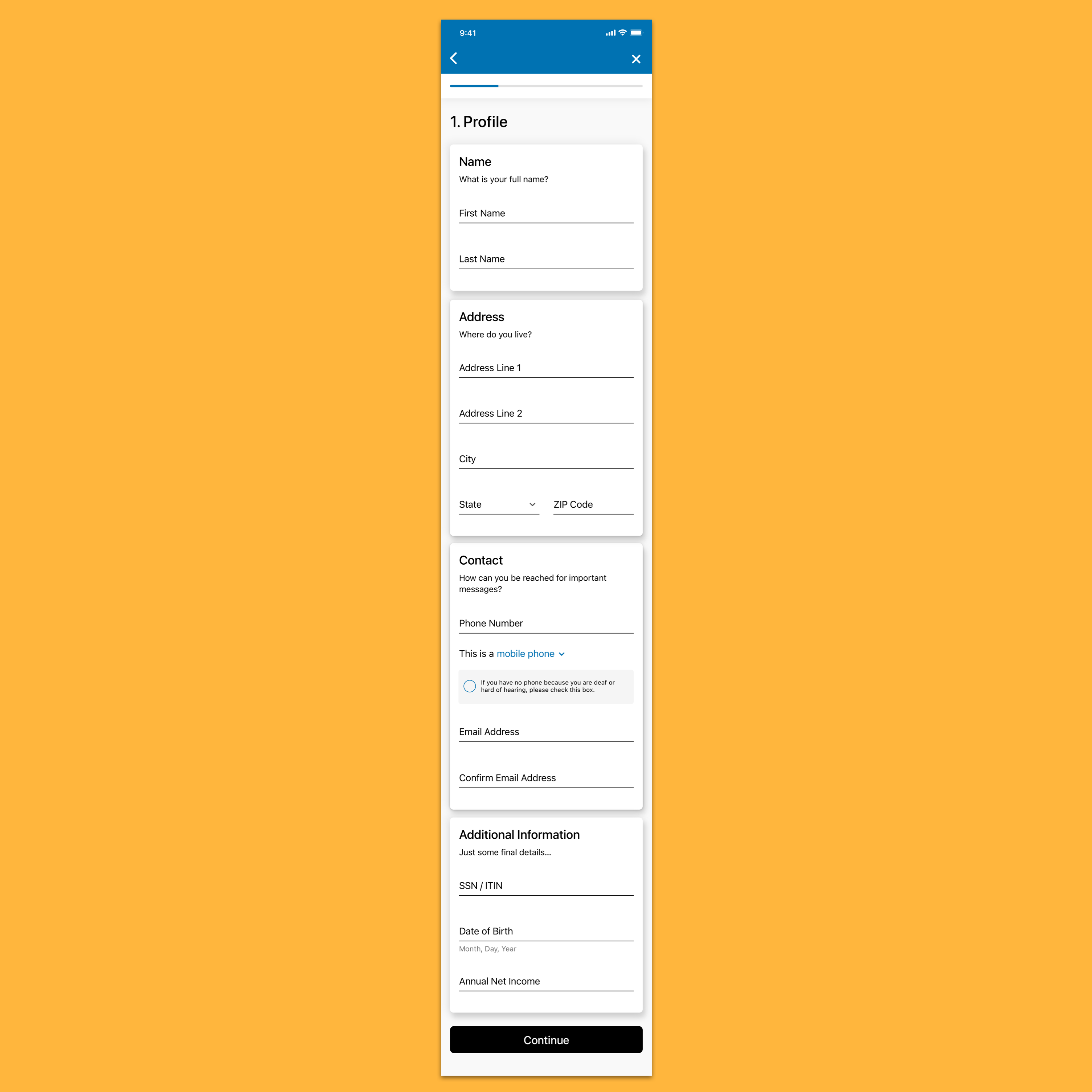
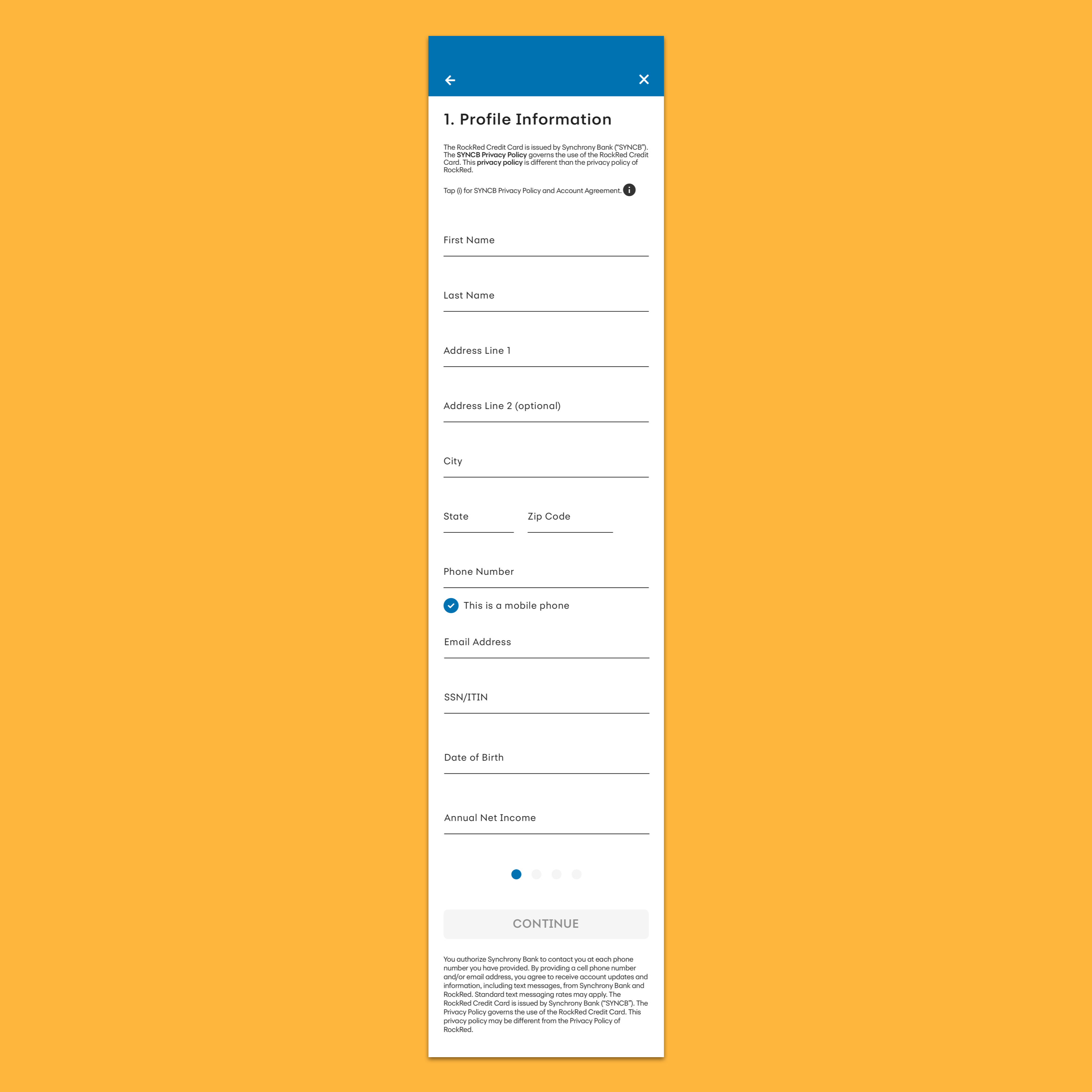
We redesigned our application form to be easy to read and fill out, and most importantly build trust in the user as they fill out their personal information.
What our new design includes -
1. We broke up the form into visual cards to aid in the user's scanning and focus.
2. Secondary headlines were used to embellish the card titles with a more personable tone. We felt it was important to sprinkle in this conversational language, as designs that included it rated higher in privacy and safety.
3. A modernized progress bar that is minimal and keeps the focus on the form.
4. The application presented as a full screen modal, where the user can tap the 'x' to close out. This allows users to focus on the task and minimizes distraction.
Looking back.
We had kicked off the redesign by looking at Apply, which caused many difficulties. The Apply experience was not used by every client, and other features in SyPI should have been prioritized.
Our whole team is working on finding a better methods towards prioritization. Our product team is looking to do kano model questionnaires in User Zoom with purely text descriptions of features to understand what the users think of the design.
Next steps.
• Work with analytics on assessing user behavior when filling out the application form, such as drop-ff rate and time on task, and compare with the old design.
• Perform another round of user testing on these designs for additional feedback and insights to use towards the next iteration.
• Reassess the visual design of the cards and work towards standardizing cards for the native apps team.