Orchard is a real estate company that simplifies the home buying and selling process.
Within the Orchard ecosystem is the real estate brokerage, title company, and lending company.

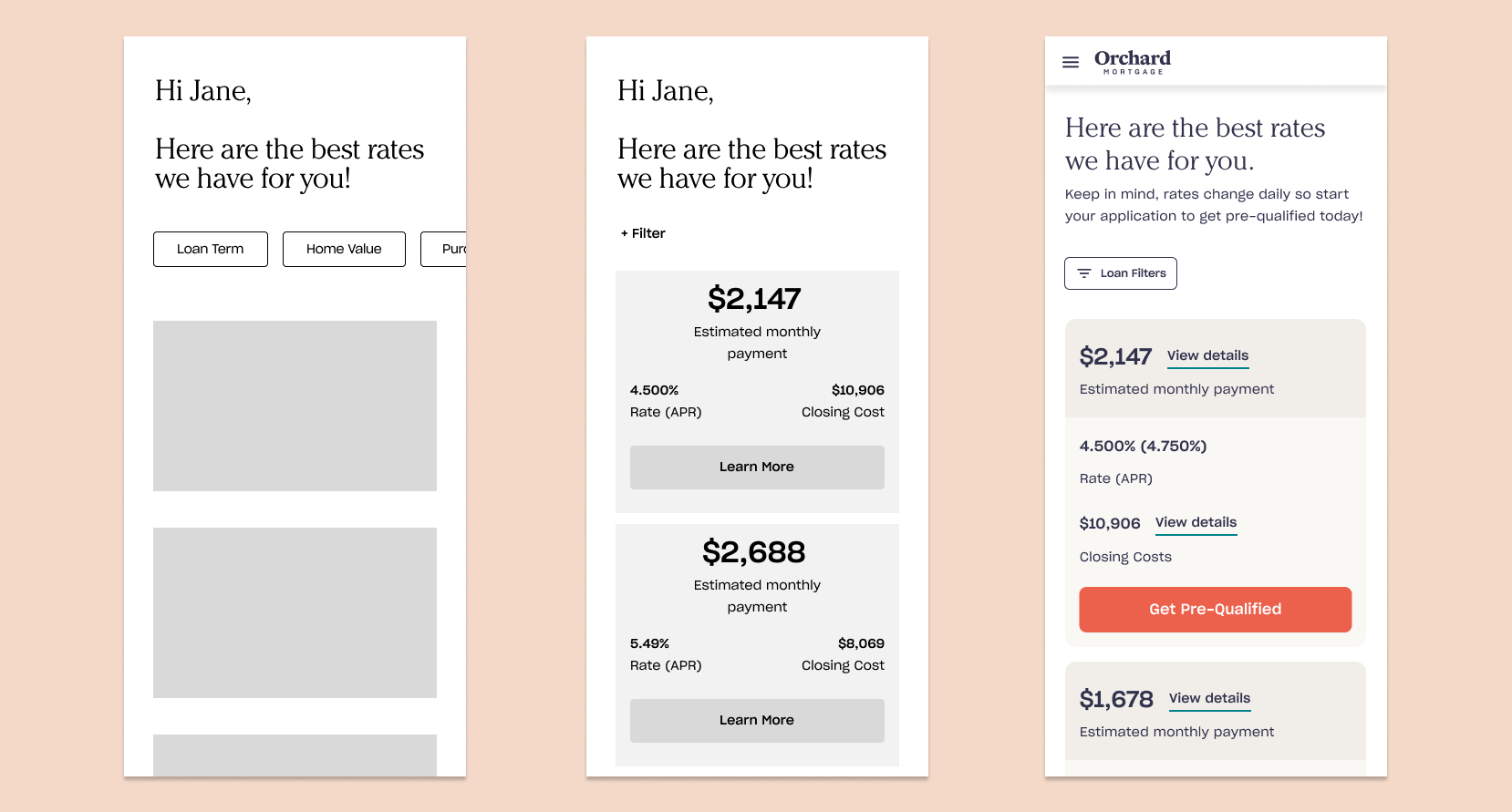
This was the redesigned and rebranded Orchard Mortgage landing page I had worked on in conjunction with this project.
Orchard Mortgage works to provide their customers with the best rate option.
When a user lands on our mortgage landing page, whether through a paid ad or search results, they can start an intake form. This form asks a variety of questions in regards to their purchasing goals, such as price, downpayment, and estimated credit score.
At the end of the intake form, the user can schedule a quick call with one of Orchard's loan officers to go over their rate options. Until that appointment, the user has no transparency into their rate options.
After the phone call, they can decide if they'd like to apply for pre-qualification, which would help to kickstart their home search.
The business wanted to focus on getting higher conversion from the mortgage intake form.
The current flow was not showing favorable conversion, so we wanted to take a second look at the existing experience. The business prioritized this project because it was a cheaper acquisition cost in acquiring brokerage customers than the traditional route.
I started the project by doing a competitive audit of our fellow mortgage company competitors, such as Better and Own Up.
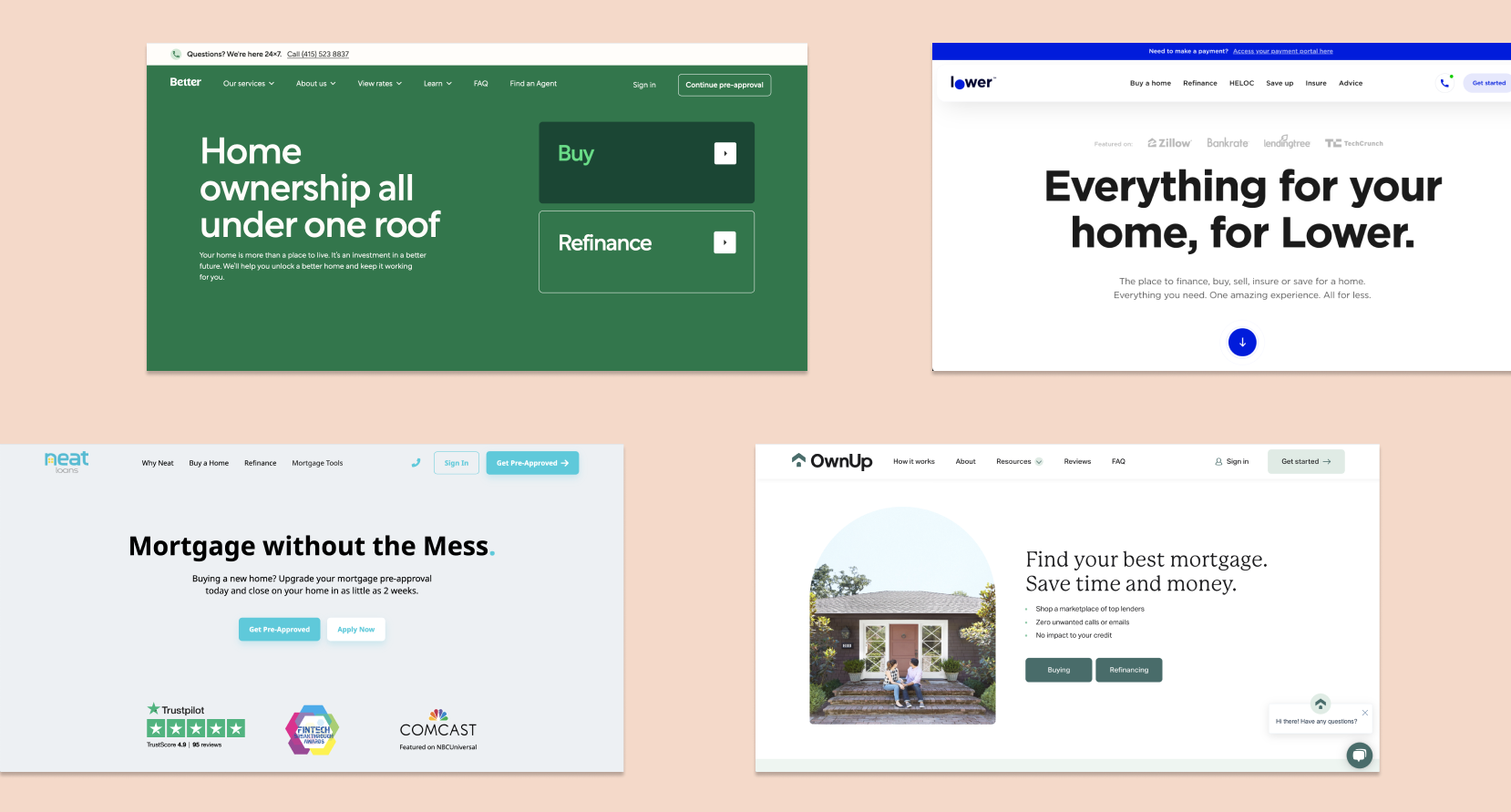
Some of the competitors that were audited
I put together a matrix of competitors, the time it took to complete the intake, and any common features to note that Orchard was not providing in their mortgage intake experience.
- 4/7 competitors provide instant rates at the end of the intake that users can reference
-5/7 competitors provide a mortgage calculator on their homepage so users can play out different scenarios
-4/7 users have dashboard experiences for them to return to when they're ready

I also listened to call recordings between our Loan Officers and our intake customers once their appointment was held.
Here were a few of the key points I found -
1. A lot of time was spent running through different scenarios to understand how they can adjust their monthly payments. Customers like understanding how they lower their monthly payments.
2. Customers ask for these numbers on paper (especially first time home buyers), broken out in layman's terms.
3. Many customers seem to be unaware of the downpayment terms (for instance, one customer put down $0 as their downpayment)
4. Some customers end the call quickly after hearing the downpayment or monthly payment as they don't have that money.
It seemed the major gap was the absence of instant rate options after a user fills out the intake.
Users needed something tangible and visual to reference and to come back to, and they needed to be able to work through different scenarios on their own time.
After identifying the problem and hypothesis to the solution, I started designing high-level concepts for us to discuss.
Understanding that due to an extremely short timeline, we needed to piece together the designs in conjunction with piecing together requirements from the business. This resulted in myself, the product manager, and engineering lead working closely together and communicating every day on the updates to the designs. I also gained lots of feedback from the design team on the project as it was being formed.
Iterating from low to high fidelity, based off of consistent discussions with my product partners.
Once the designs were at a good point, we shared them with other stakeholders on the project to get feedback.
Their feedback helped us to formulate a few user tests we wanted to run in order to validate our designs before hand-off.
Some of the questions -
Some of the questions -
- Do users understand what to take away from looking at this screen? Should we provide more direction? Are five rate options too overwhelming?
- Do users understand that the main number they're seeing is the full estimated monthly payment and not just the P&I?
- Do users understand that the estimated monthly payment includes more than just the P&I?
- Do users understand how to interact with the payment breakdown screen?
We ran two different tests.
The first test focused on the number of rate options to display and how to help them understand their rates concisely.
Test plan - A/B test the original designs against a new design. Rate the user's level of understanding of their rate options on a scale of 1 to 5 to compare and contrast.
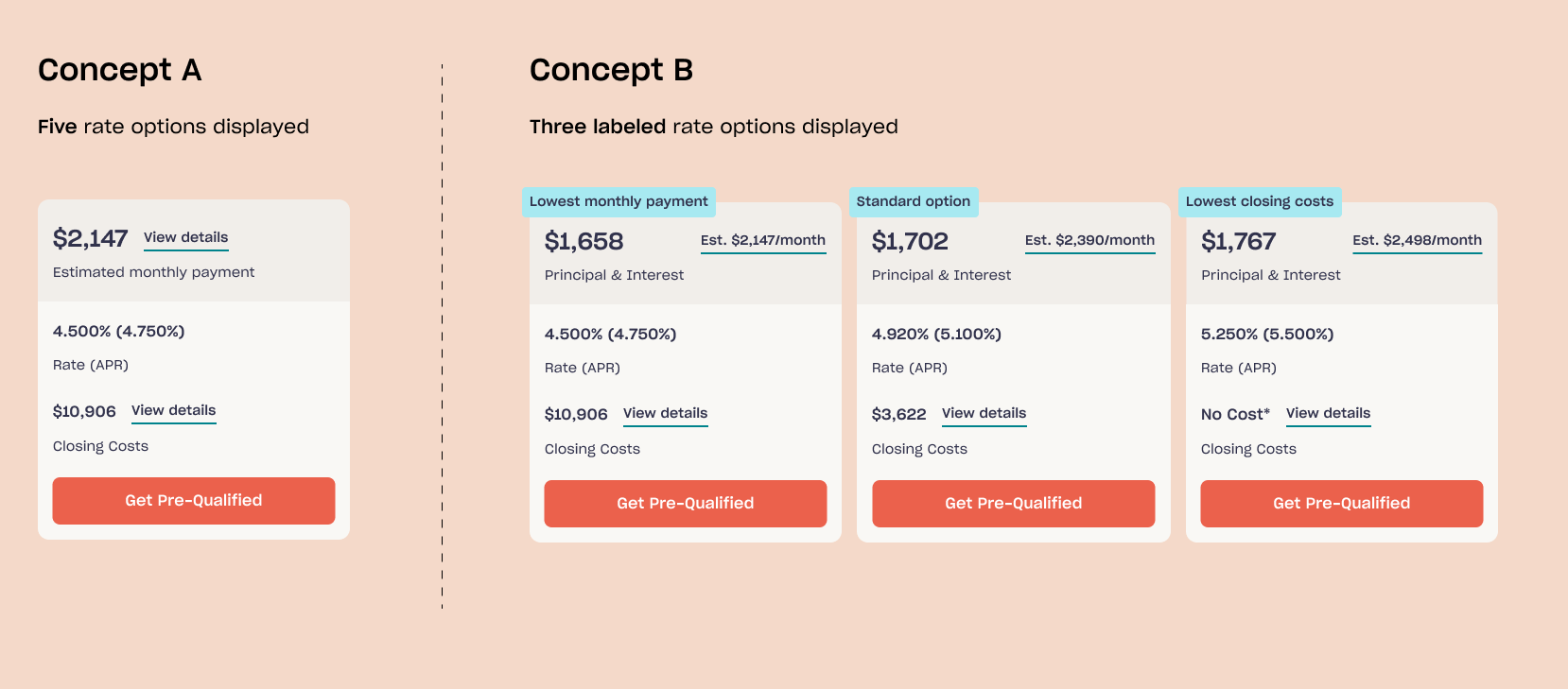
Results - We decided to move forward with Concept B, in that users were much quicker in drawing clear conclusions from the labels and only with three rate options. Their level of understanding rated higher for Concept B.
The second test was meant to decide which number figure we would have at the forefront of our rate option.
We were initially displaying an estimated monthly payment, but competitors were displaying just Principal & Interest (which is a part of the estimated monthly payment). Would users be comparing our estimated monthly payment against other competitors' P&I figure? Would this cause them to believe our rates were higher?
Test plan - A/B/C test the original design against two new designs. Do users understand the difference between the estimated monthly payment and the P&I?
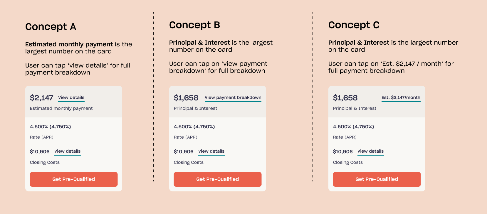
Results - General sentiment for Concept A was that they were surprised to see more than the P&I included in the estimated monthly payment. While there were no distinguishable differences in assumptions of what's included in the payment breakdown between Concepts B and C, Concept C drew out more positive responses.
We took these findings and bundled up our final designs, and handed them off to our engineers.

Next steps.
- Test out different CTA language for the primary button on each rate card. "Get pre-qualified", "Get started", "Learn more".
- Watch hotjar sessions to track user behavior, and spot any areas of frustration as well as commonly used actions to focus further on
- Work with product manager to create a fully streamlined experience that connects these rates to their pre-qual application.
- Watch hotjar sessions to track user behavior, and spot any areas of frustration as well as commonly used actions to focus further on
- Work with product manager to create a fully streamlined experience that connects these rates to their pre-qual application.