We redesigned the credit card management experience for the Synchrony Plug-In.
Our first client to launch with the new design, Amazon, saw an increase in their credit card app store rating from a 2.7 to a 4.7.
The Synchrony Plug-In (SyPI) was a digital solution for our retail credit card holders to pay off their bills within the retailer app. After around five years in the market, SyPI was due for a refresh, as it was a heavily developer-driven product with little to no design support or guidance.
The business had tasked our team with redesigning the whole experience, wanting to see a change in user sentiment through app store ratings and reviews.
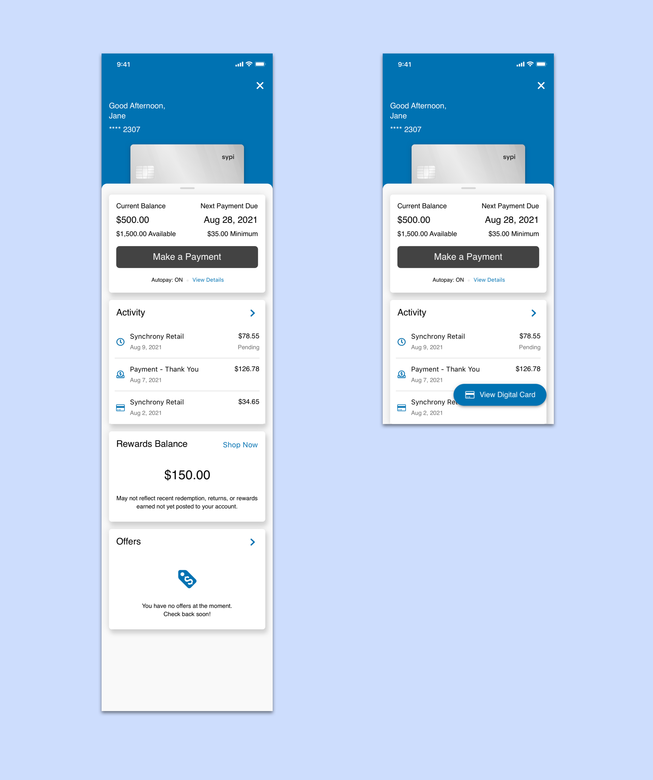
The original SyPI experience
Where we started off -
The SyPI experience was over five years old when we started looking into redesigning. During that time, with little design guidance, the experience was holding users back from doing what they needed and drowning developers with bugs.
There were multiple areas of improvement, but the most apparent issues we needed to address were in the navigation.
SyPI was presented alongside retailer app's navigation, so there could be conflicting interactions throughout the experience. Namely, if the retailer app had a bottom tab bar, users would see two tab bars simultaneously.
Along with that, there was no clear visual hierarchy to aid the user in their journey, such as paying their bill.
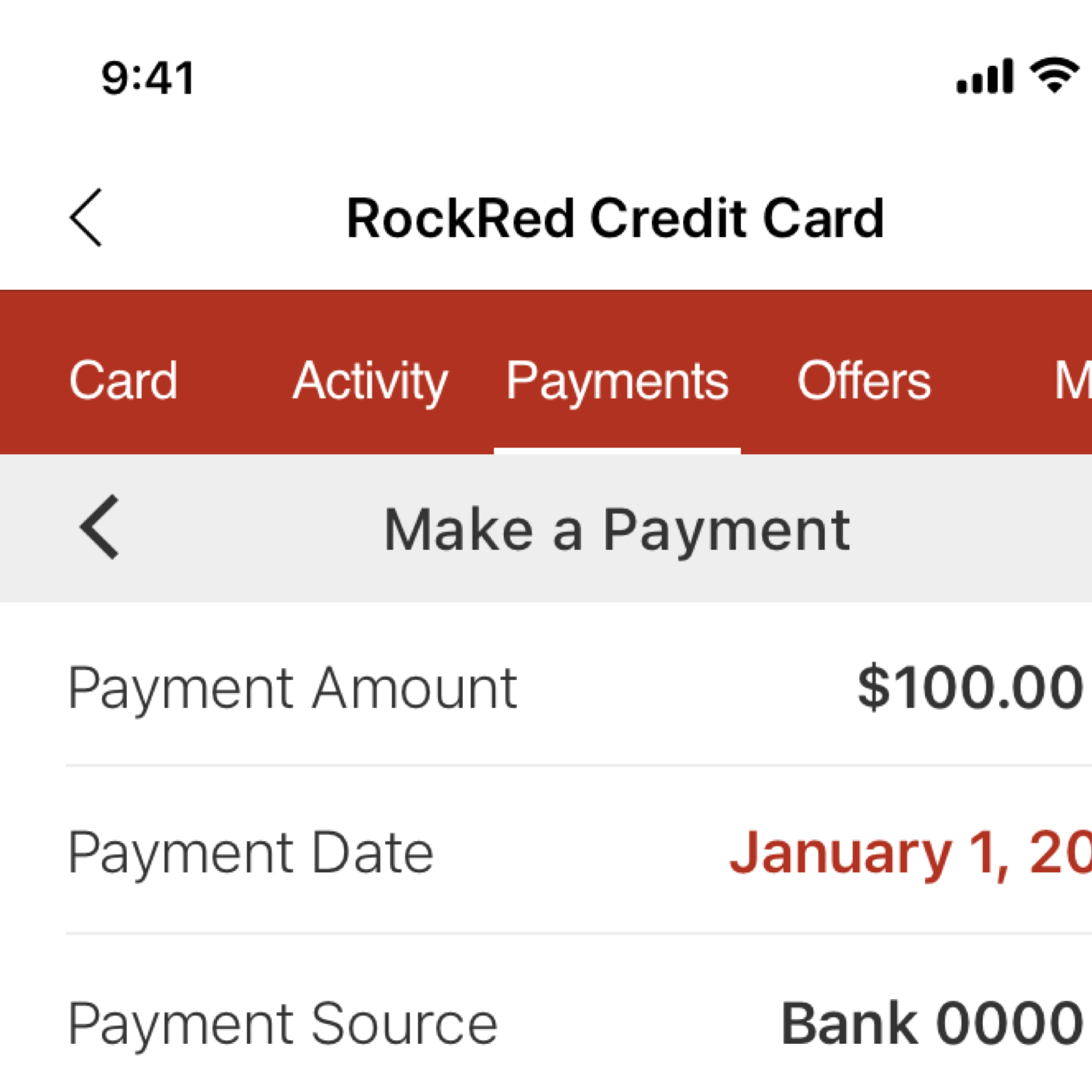
If the retailer app presented a back button in their navigation for the user to exit SyPI and return to their experience, users could see two back buttons simultaneously.
There were challenges we identified that allowed for us to create some high level goals -
Challenges
1. Low app store ratings and poor reviews
2. Frustrated developer team members from a lack of design guidance and no standardization
Goals
1. Refresh the user experience to improve functionality and build trust in the user
2. Establish a process of standardization and documentation to achieve an improved workflow for developers
We next looked at how other apps in the marketplace were solving similar challenges.
We studied apps in the financial industry, such as Amex and Chase to pull commonly used patterns that users were already familiar with when handling their credit cards.
We also took a look at popular apps in the marketplace, such as Instagram and Uber, to observe how similar navigation problems were being solved in a different context.
What we found was that -
• Brands used color to promote a stronger brand presence in the experience
• Full screen modals were commonly used to take users to a separate focused experience
• Conversational language makes the experience more modern and personable
• Cards were used as a way of navigating and organizing content.
We also made sure to apply some of the learnings we got from previous tests we had performed in relation to redesigning the application form experience. The key findings included -
• Users prefer scrolling in an application rather than tapping through several screens
• Designs with conversational language rated 5% higher in safety and privacy
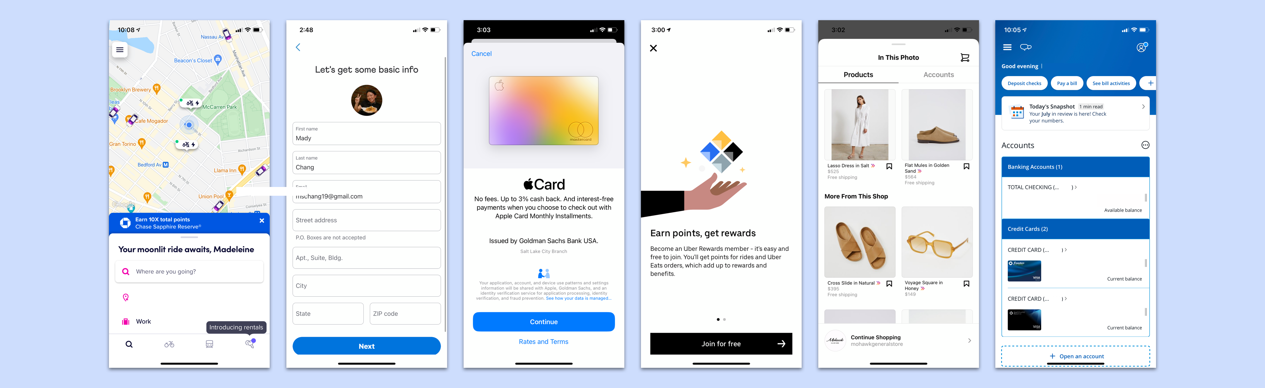
Some of the apps we looked at for research
Up next, we took what we learned and what we knew and started sketching ideas to turn them into bare-bone prototypes to visualize.
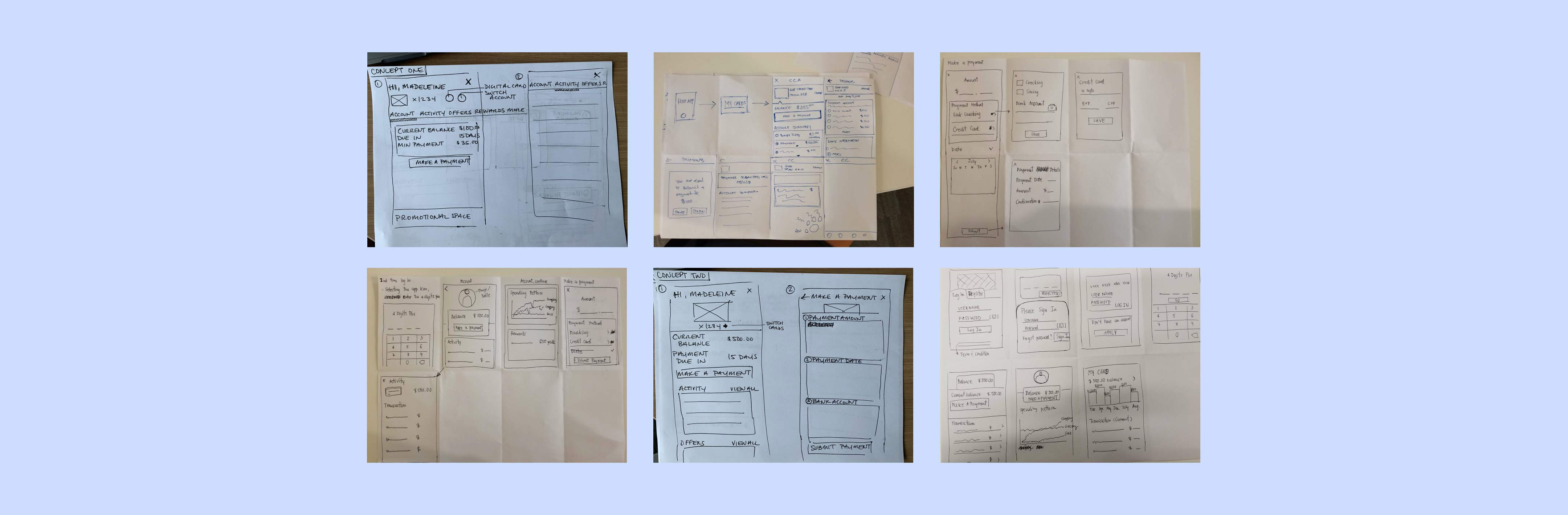
Quick sketching with the team
We were interested in seeing if users preferred navigating through a tab bar or vertical cards. We had the users perform a few tasks with two different concepts, and the results came back in favor of a tab bar navigation (similar to our original design).
However, from this point the business direction was made to move forward with the vertical card layout. The overall UX strategy directed by business was to work towards standardizing designs across all of Synchrony's digital products, and the vertical card layout was more conducive to that approach. Along with that, developers were heavily advocating for the cards navigation as it was more flexible and modular, especially as the scope of our product grew.
We moved forward with the learnings we already had through past testing, research on our competitors, best practices, and standardization strategies.
Early stages of concepting
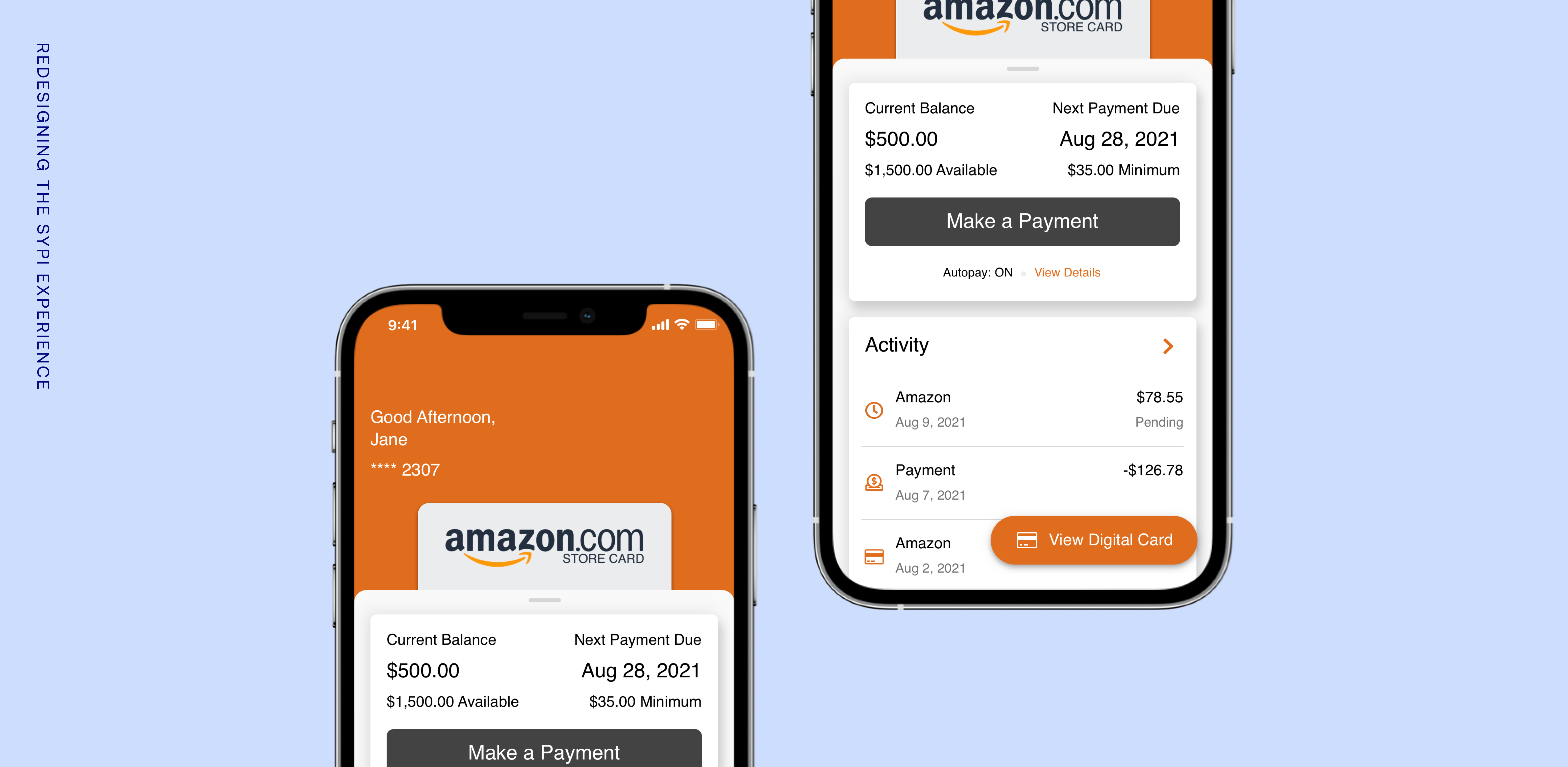
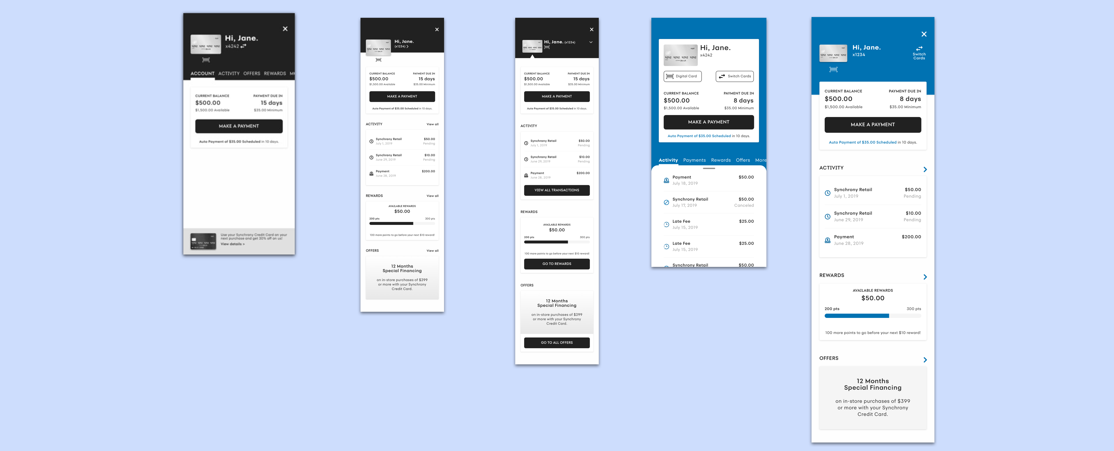
We wanted our redesigned experience to enable users in owning the process of managing their accounts with confidence and trust in our product.
Here were the things we implemented in our new account summary
1. The new experience presented as a full screen modal, to allow users to focus on what they need and eliminate confusions with the host app.
2. A time-of-day greeting with the user's first name to promote a conversational tone upon entering SyPI.
3. A more distinct button hierarchy, with the Make a Payment button front-and-center as the primary button on the screen. The Make a Payment flow is the most visited section of SyPI.
4. A vertical card navigation layout, providing users a glimpse of each section of the app. Cards are a key driver for engagement and discoverability.
We also wanted the redesign to support developers in their work, providing them with standardization, documentation, and ample communication.
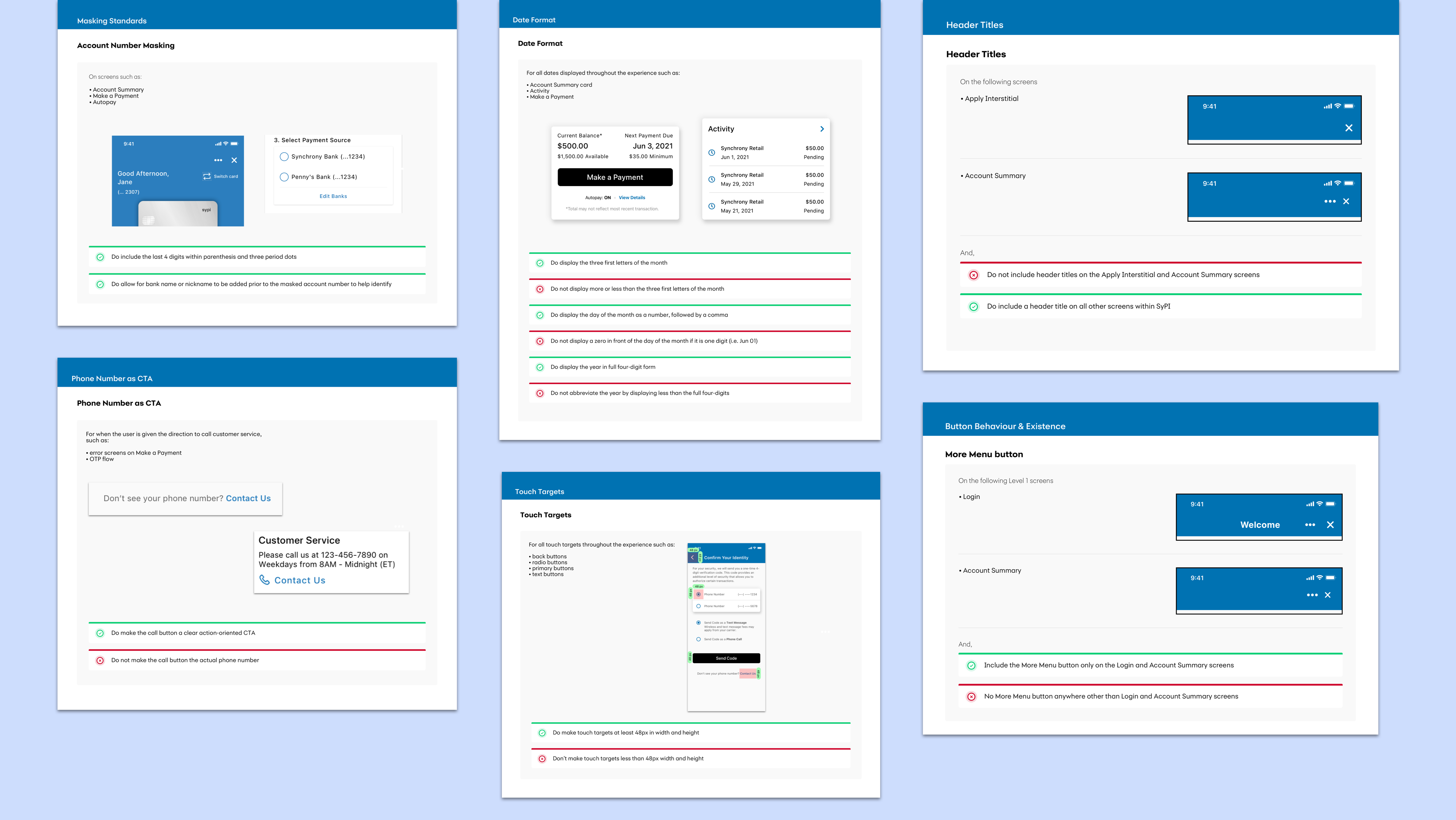
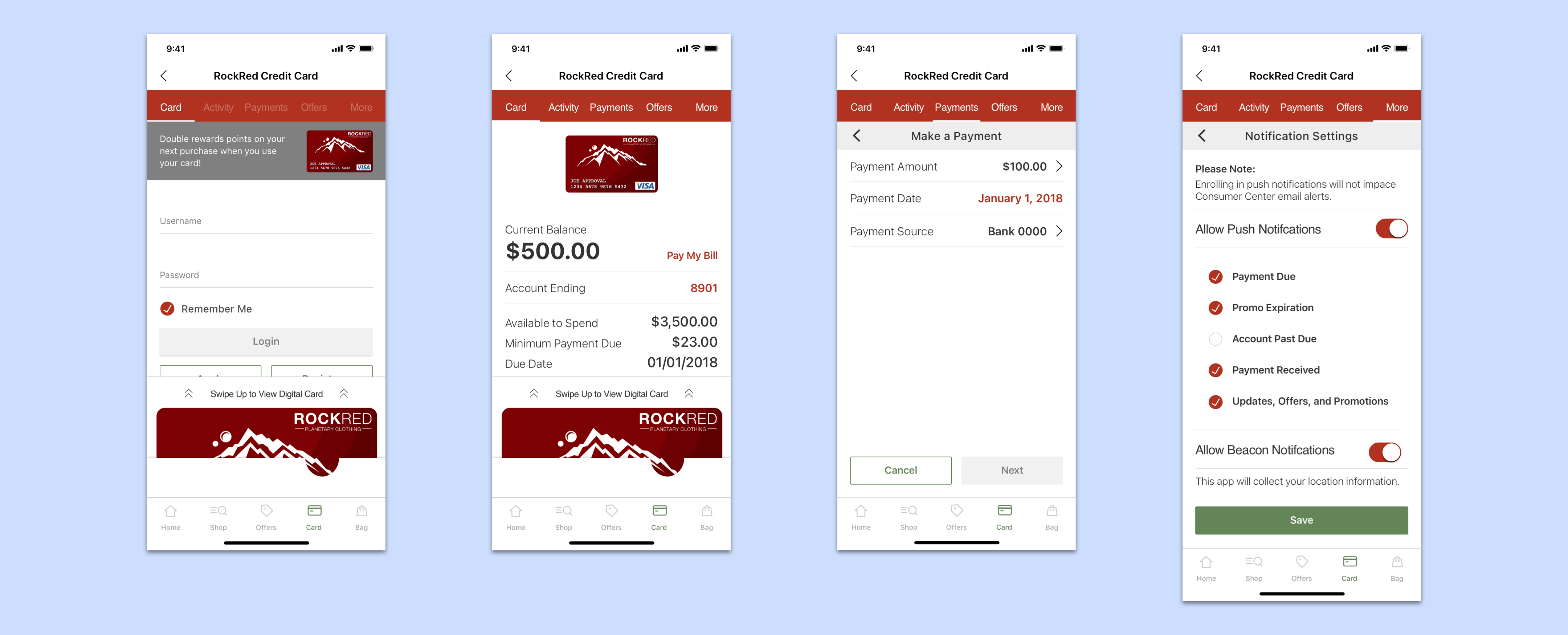
A few of our guideline sheets
Here were the ways we improved our workflow with our development team mates
1. We set up weekly meetings with the development team where we would present our design solutions, ask questions to the devs, and receive feedback from the devs. As our product team was broken up into four separate agile teams, the communication was often scattered around. We identified a need for one dedicated meeting to openly communicate ideas over video call.
2. We provided documentation for general guidelines and rules, inspired by Material Design's guidelines. This documentation is continually evolving as the design is improved, and includes everything from form field masking to error strategies.
After months of work, redesigning every screen in SyPI and supporting the developers on building, we finally launched the new and improved experience. Our first client to launch was Amazon.
Amazon was also our only client at that time who had a standalone app for the SyPI experience, rather than as a plug-in within their own app. This allowed for us to get measurable feedback from users through the app store. The redesign launch proved to be very positive and impactful.
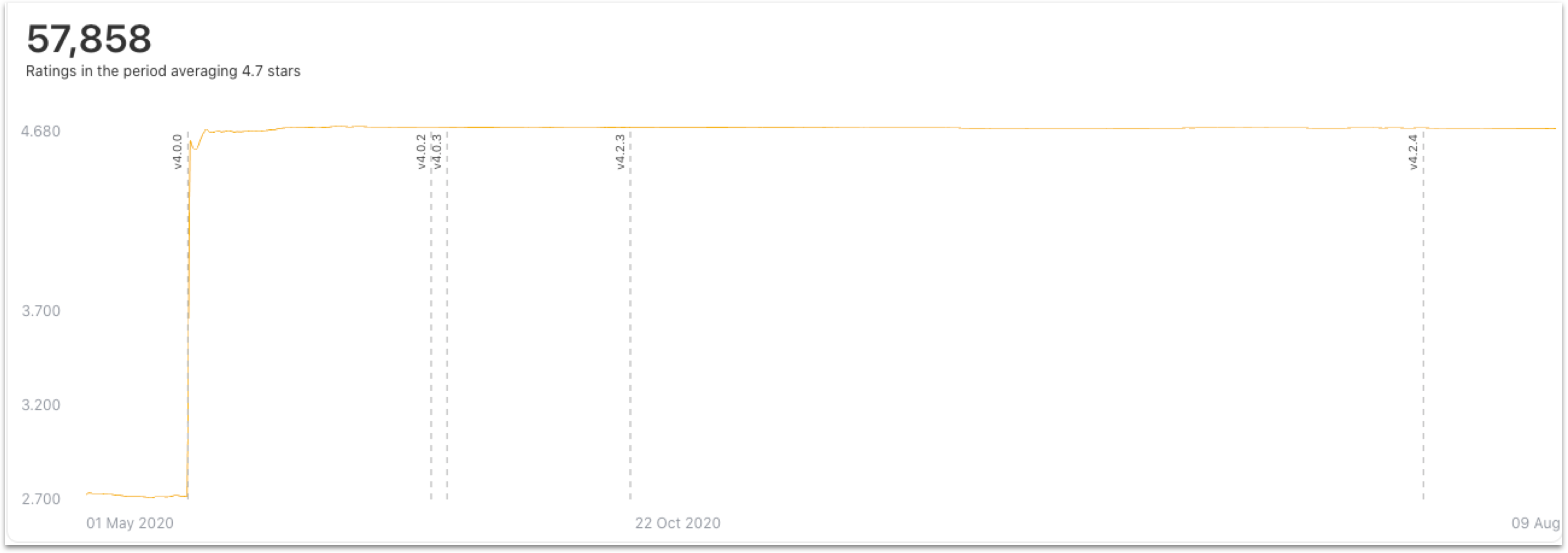
Line chart showing our ratings increase after the release of version 4.0 (the redesign)
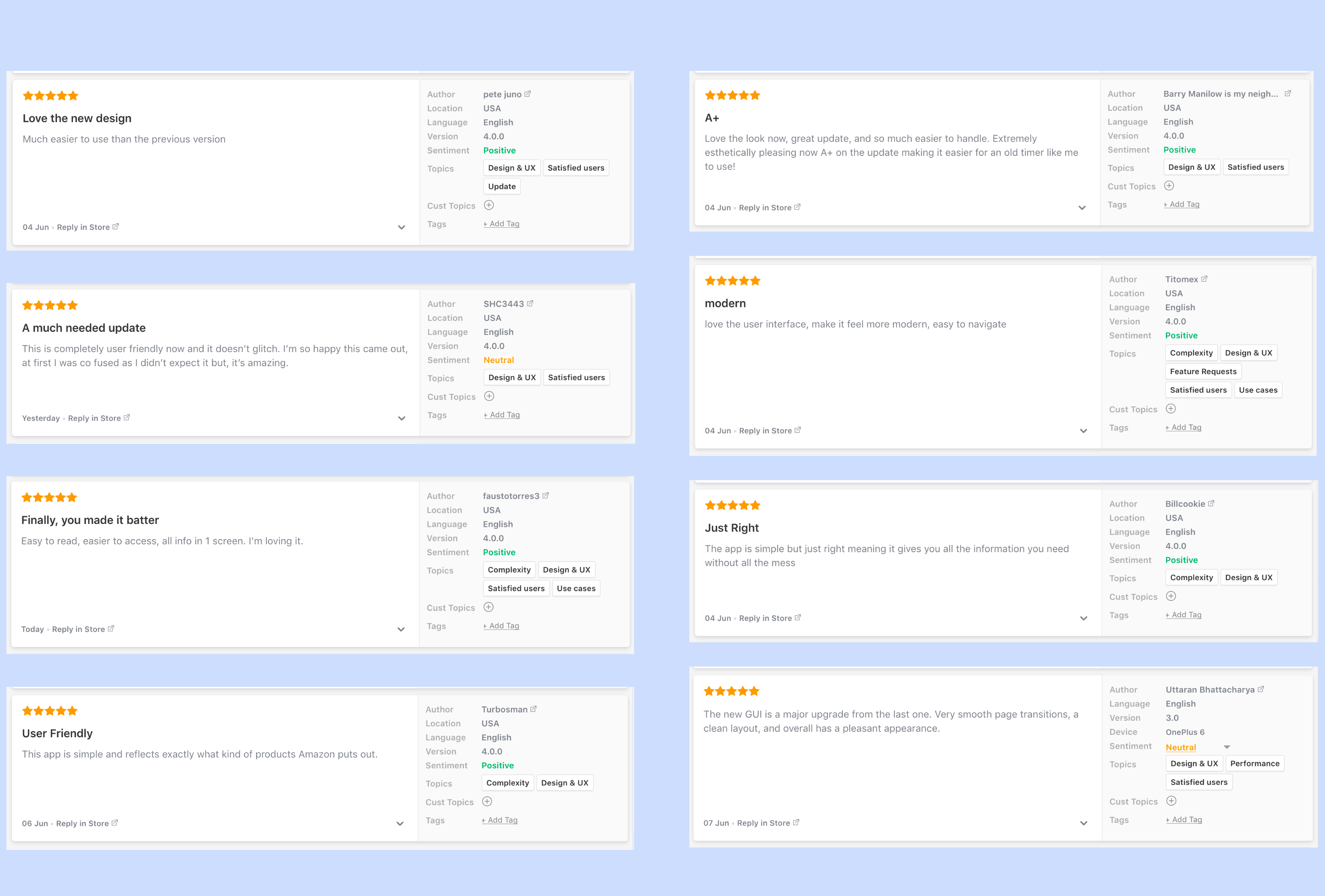
App store reviews on the Amazon Store Card app after the redesign
The launch of the redesign laid a solid foundation to move SyPI forward. The experience will continue to evolve as we gain learnings from version releases, client feedback, and most importantly the user.
Some things we would like to work on next
1. Work with the devs to explore custom font capabilities to create a more branded experience
2. Work on implementing dynamic type to aid in responsiveness and ADA compatibility
3. Implement a data-driven approach, working closely with the analytics team on key trends and behaviors to inform design decisions more robustly
4. Work on a more mature color configuration, as we work with more clients that have black as their primary color